The Evolution of LAIDBACK: "Behind-the-Scenes"
I recently launched a micro-watch brand called LAIDBACK. The maiden series of this brand (not surprisingly) is called FREELANCER which comes in a rich Red Sandalwood version and a cheerful Bamboo version. The Kickstarter campaign is currently LIVE (ends Sep 29 2016 12:12 PM CDT) and can be found at the following link: http://bit.ly/laidbackkickstart
I've written a bit about the inspiration behind LAIDBACK on the campaign page but I wanted to share some "behind-the-scenes" details about the evolution of the brand.
I began freelancing full-time in 2013. My girlfriend Isida, quit her job in New York in 2014 and began freelancing with me. In the beginning we put in a lot of hours of work: building our online portfolios, working on small assignments and learning from our interactions with poor clients; but soon after we learnt the ropes at freelancing we began to raise our rates, work lesser hours, take on fewer projects and still earn the same as we did before.
We decided to spend our income (and extra time) on traveling and freelancing, together! We travelled and lived in the United States, Mexico, Sri Lanka, Turkey, Albania, Serbia and the Dominican Republic.
Despite all the traveling, we felt like we were living life at a slower pace, the way it should be. In fact, it was during these moments of solitude and peace in Albania that the first concepts of the watch design took off.


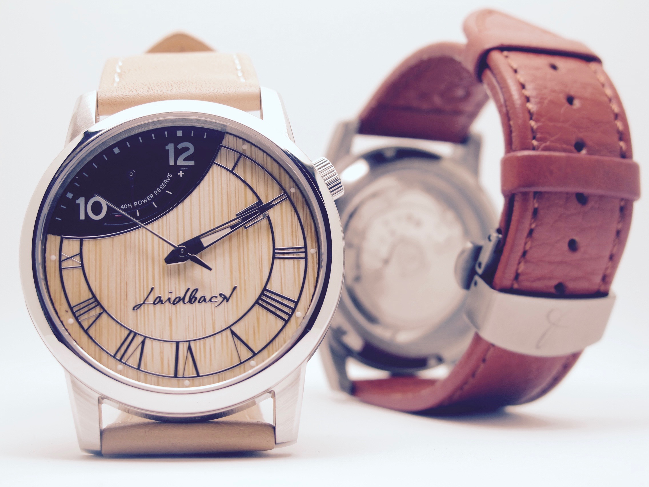
As you can see in the sketches above, the watch was always intended to take on a “laidback” feel. In fact, the Roman numeral track was designed to represent the shape of a hammock. We also chose the cut-out between 10-12 to retain the visual symmetry and rotated the movement to achieve this.
The "laidback" inspiration was in-turn inspired from the concept of "SUSEGAD" - living a content life - that is commonly associated with the state of Goa in India.
Eventually, we settled on the name LAIDBACK (with a backwards “k”) as the name of the brand.

You can see the 4th revision of the design sketch below.

Over the next few month, we continued to make improvements to the watch elements such as the hands, the crown, the power-reserve meter and the date window. For example, on a trip to the south of Albania, in Sarande, I noticed a clock hanging outside a restaurant which inspired me to invert the Roman numeral track. This added a very classic feel to the watch that I was trying to achieve.

I had always envisioned that the watch dial would be created of wood, even if this would be challenging to manufacture. We spent a lot of our free time in nature, by the beaches, on the hills; and I wanted to include this side of freelancing into the watch. And, I just love the combination of wood and steel!
If you pay attention to the dial face to the number 4 (like Brandon Riley on Kickstarter did), we used "IIII" instead of "IV" on the Roman numeral track. This is not common on conventional watches but was actually common in older, classic watches.
When I was designing the watch, I made the intentional choice to go with IIII (which was actually common back in the day, particular in old classic watches) for aesthetic reasons - three reasons in fact:
- If you look at a watch face with "regular" Roman numerals and look at the numerals opposite to each other, they appear to be in perfect balance except for the 'heavy' VIII and the 'light' IV. By using a "heavy" IIII it is possible to re-establish the optical balance.
- If you were to divide the watch face vertically you would find that each half has exactly 14 Roman characters when "IIII" is used instead of "IV".
- Lastly, the central line of the FREELANCER watch design follows along the 11 to 5 axis (instead of the traditional 12 to 6 axis). What this means is that the "V" is the boldest, largest Roman numeral on the watch. This is further emphasized by removing the V that would have appeared in the more conventional "IV".